UI Design: Pitch-Ready Experiences
Strategy meets creativity to craft compelling digital experiences. Commissioned by IDX, I designed key interface pages for GEO, HEINEKEN CAREERS, MGX, JD GROUP, SMITHS, KELLER and more, each tailored for high-impact pitches. My approach balances brand identity, user engagement, and seamless functionality to deliver visually striking and intuitive designs.
Explore the selection of projects below to see how each design elevates the brand narrative and enhances user interactions.
A selection of some of the best presentation I have designed in the last 12 months. B2B clients UK.
Selection of the latest projects developed this year, mainly UI for B2B on some really exciting pitches and redesigns.
I am proud to announce a very interesting collaboration with the TinkTank & channel Parabellum. I had the pleasure of working with Mirko Campochiari and General Paolo Capitini on the creation of the book Le Parole della Guerra, a compedium of historical-military analysis. In the book you will find dozens of infographics and diagrams designed by me.
The book is available on Amazon here: https://amzn.eu/d/7UoQxUu
The purpose of this publication is to contribute to initial education on a topic that must not only be the subject of political or moral disputes, but which must first be understood in its more concrete meanings. The authors' objective is to contribute to the formation of a widespread conscience and awareness, especially on such a divisive topic.
Sono fiero di annunciare una interssantissima collaborazione col TinkTank & channel Parabellum. Ho avuto il piacere di lavorare con Mirko Campochiari e il Generale Paolo Capitini alla creazione del libro Le Parole della Guerra, un compedium di analisi storico-militare. Nel libro potrete trovare decine di infografiche e diagrammi da me disegnati.
Il libro è disponibile su amazon qui: https://amzn.eu/d/7UoQxUu
Lo scopo di questa pubblicazione è di contribuire ad una prima scolarizzazione su un argomento che non deve essere oggetto solo di dispute a sfondo politico o morale, ma che va preliminarmente compreso nei suoi significati più concreti. L’obiettivo degli autori è di contribuire alla formazione di una coscienza e di una consapevolezza diffusa specie su un tema così divisivo.
#geopolitica #geopolitics #graphicdesign #parabellumstoria #parabellum #infographics #infografica #storia #militare
Another really interesting part of my job is to review, analyse and re-structure existing platforms aiming to transform new digital environments, on this page you can see some examples of module library reviews, new FIGMA libraries and digital branded applications.
In order of appearance:
1
Hubbub by Transmission is the one-stop shop for expert insights and guidance to help create LinkedIn content and creative audience can’t ignore.
Project’s scope: Design a website to drive traffic to specific LinkedIn/ Transmission contents.
Contribution: UI design and social design.
Design rationale: Colorful and playful look and feel to be consistent with the Transmission visual identity.
2021/22 https://transmissionagency.com/en-gb/hubbub
2.
Arachnys accelerates onboarding and monitoring by providing the best global KYC and AML data. Enriched, intelligent data on customers enables straight-through processing and means fewer customer touchpoints, less risk and quicker revenue.
Project’s scope: Aiming to create a website presenting all Arachnys products and promote the company in B2B market.
Contribution: Visual identity, illustration and UI design.
Design rationale: The concept of “hero” as a methaphorical language to communicate the importance of the Arachnys analyst. Tech-pop design, modular, elegant.
2018 https://www.arachnys.com The company has been purchased and changed his identity recently.
3.
ARuVR is a multi-award-winning platform, ARuVR makes impactful real-time, on, and off-line, captivating Virtual Reality (VR) business presentations and interactive training experiences, a Reality.
Project’s scope: UI design to renovate the company visual identity from Vrtuoso to ARuVR.
Contribution: Visual identity and UI design.
Design rationale: Simplicity, elegance, modular and tech look and feel.
2022 / currently in development
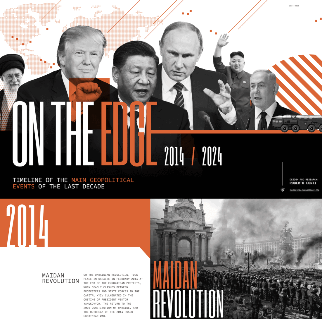
I have developed an analytical timeline that traces the main geopolitical events from 2014 to 2024, with the aim of providing a clear and structured vision of the dynamics that have shaped global balances. Using maps, diagrams, and images, I have highlighted key moments, international crises, strategic developments, and emerging alliances, connecting them to major economic, political, and environmental transformations.
My intent has been to connect the dots between seemingly isolated events, offering a tool that not only summarizes the facts but also helps to understand their broader impact on the global stage. I designed this timeline for anyone interested in delving deeper into the geopolitical complexity of the past decade, from professionals to enthusiasts, utilizing design to make even the most complex topics accessible and engaging.
This work stems from my belief that geopolitical analysis is essential to interpret the present and anticipate the future. With this timeline, I wanted to combine analytical rigor with effective visual storytelling, demonstrating how design can be a powerful tool to understand and communicate the challenges of the contemporary world.
The project has an educational purpose: to bring out a comprehensive vision that not only summarizes the facts but also encourages reflection on their implications and long-term impacts. It is designed for a diverse audience, from students to geopolitical enthusiasts, offering an engaging experience to explore the complexity of the contemporary world.
Animated Powerpoint infographic showing how the company connects, simplifies and manages pharmaceutical and healthcare customers’ supply chains, from origin to destination.
Focusing on the presentation as a long scrolling interactive page.
In the last couple of months I worked for Transmission Agency. It has been an exciting time and I have been lucky enough to work on some interesting brands producing illustrated interactive presentations. Mainly B2B projects for Citrix, Verizon, HP, Carrefour, Shure and Dropbox.
On the right you can see some of the designs.
Presentation design, Infographics and Illustration.
Among many projects that I worked at Transmission Agency one of the most satisfying was creating reports and off-line design for HP-Global. It was a unique opportunity to push their branding to the limits giving space to layout creativity and working on some great contents and print assets. The examples you see are report spreads and some pages from the German Customer Magazine 2020/21.
Asset creation for Google campaigns including infographics, social media posts, and UI - BlueStateDigital 2016
Few examples of deck design I have been working recently including pitches for Zone, Analog Folk, Pulse and Amplify working on brands such Audi, FA Group, Melody, Jack Daniels, Ryobi.
Softwares used: Powerpoint, Keynote, Google Slides.
Between 2015 and 2018 I worked on a good number of infographic projects. On this page you can see few examples for:
Marketo, Thomson, Gemalto, Axa, in collaboration with Octopus Group and Brands2Life, Oliver Agency, La Plage Studio, MCSaatchi/Jacamo
(Tool: Adobe Illustrator)
360' degrees branding at Arachnys included an extended range of vector illustrations based on the empowerment of the analyst and financial investigation.
The infographic about "A day in the life of an analyst", the cover for the "White Paper" publication included multiple drafts and the UI design for the site.
Branding proposals for the new organic product "By Joseph"
At BlueStateDigital I have been working on a 360 degrees campaign for Bloomberg-Business-Innovators 2016, I have been designing assets for newslettersn, Keynote presentations, social posts and animated gifs and UI design.
Series of illustrations and characters designed for Picletta Facebook App on 2016. Vector illustrations based on user interaction trends on the app.
I have been commissioned to work on the new credit book for Krow Agency, here there are some concepts and infographics related to the agency presentation and portfolio. June 2017
Three Brave Words campaign.
Visual identity and social assets - BlueStateDigital.
Recently I have been working on some typographic projects related with my Ancient History studies, here there are some examples.
More details can be discovered on Behance
Series of illustrative icons representing the operative fields of the company, commissioned by PaymentSense in December 2017
In the recent years I have been lucky enough to work on various pitch presentations for important clients such The Outfit, Ogivly, Mtv, MC Saatchi, Debut, Google, Blue State Digital, Digitas Lbi, Mullen Lowe. Here there are few examples.
UI Design and infographic for International Rescue Committee - Studio La-Plage - May 2016
This is a selection of some illustrative content and application mockups made through last year and January/February 2018
Through the recent years I made few studies on ancient art, consequently I have been drawing a lot, researching ancient ornaments and symbology, particularly on Romanesque, Etruscan, Classic art, If you are interested in commissioned drawing please get in touch!
Along with my archeological studies I created some infographics related specifically to the roman stage of Londinium, Palmyra, Troy and medieval architecture.
User interface design for CMC platform / BIO Agency 2015
UI Design for Talker Tailor Trouble Maker at Studio La-Plage
http://www.talkertailor.com
Brad identity design and UI for the new IceAid packaging / M&C Saatchi December 2015
Art Direction for Jeeni App : Logo Design / guidelines / webdesign.
http://www.jeeni.co/
As creative partner at La-Plage I designed the pages for some interactive content of the Harry Potter story (Pottermore.com)
Events graphics designed at Vision9 (London) for the Puma event in New Castle.
New Proposals for Future Tech Track Branding.
Future Tech is for the curious-minded. It was showcased as a part of Nine Worlds annual Geek Festival and allowed attendees to experience the latest innovations as well as learn from pioneers in tech: real scientists and independent practitioners, hackers and inventors. Apart from talks that challenged and amused, we featured interactive sessions that included live demonstrations, practical workshops, hacktivism, gaming, and socialising.
Along with my typographic research I started a series of fauxaic compositions.
More details can be seen here
Branding / Ui and Ux design 2014
LetzChange is a non-profit organization helping you discover and donate to vetted and verified Indian NGO projects online.
http://letzchange.org
Concepts UI Design for the new website of Rock&Pebble - London March 2015
Artworks and info-graphics for Neo Coffee promo video, project discussed and crafted at Xpono London - February 2015
Thanks to DieGestalten Verlag from Berlin to host me with some artworks on the 4th release of Los Logos.
Aveon 9 website UI and Tiggou comics UI and layout.
Tiggou is one of the intellectual property of Rovolt (entertainment company), I have been designing the pitch bible of the Tiggou characters and the website. Age target: 4 - 6 years old. The tricky part has been designing an interface suitable for children and easy to use but at the same time suitable also for parents. (Veddis - London 2013)
Branding for various theatre companies in Brescia (Italy) - 2004/2007
Collection of flyers for music and special nights. Hertzquake is a Drum and Base crew based on Milan. 2005